Showing posts with label Pet Peeves. Show all posts

Sunday, January 26, 2020

Pet Peeves - Missing Comic-Inspired Titles

One of the great pleasures of getting a Newspaper comic collection is finding the relevant comic title name drop inside.  While the comic was running, it was a challenge trying to guess what the title of the next collection would be.  Usually, we were nowhere close, because we couldn't possibly enter the minds of the cartoonists drawing them.

But the annoyance comes when there's an inspired title, and no relevant accompanying comic inside.  This could be understandable if the comic repeats cover space, and would be considered cheating reusing space that could be better filled by another comic or doodle artwork.  The earliest example would be the first For Better or For Worse book, back when it was just starting out, and hadn't gained cult status yet.

It would take years before the relevant comic would be seen again.  I doubt many longtime readers even knew it was based on a strip, only reworked and redrawn.

Another annoyance is when the title shows up, but doesn't show up in that book, but in another.  This was evident for the phrases, "It must be Nice" and "Pushing 40".  But FBOFW isn't the only comic guilty of this low-key crime.

Perplexingly enough, this extra-long Cathy cover on par with Isekai titles didn't have this comic, but the next collection did.

But this wasn't the only instance.


It can be particularly erroneous when a comic makes a passing remark that made perfect sense when running, but as the years pass by and the collective memory of the audience dims, they no longer recall the significance or meaning behind the titles.  Particularly for one of Adam's last long-running mini-arcs.


In some cases, the inspiration can be so obscure and unseen that even long-time fans may not even know where the reference came from, in the case of this Sunday Shoe throwaway panel:


Ironically enough, you're more likely to see a comic title on the back of a paperback that splits a large collection in half.  Despite getting a raw end of the deal, these things were ubiquitous, which suggests somebody out there was buying these things.  I don't have any physical copies around, but I do remember one particular example.


Just imagine the above colourized and reorganized in a 2x2 panel layer.  The thing about this comic?  It didn't appear in "Wake me up when I'm a Size 5" as noted, but in "Thin Thighs in Thirty Years".  What's the point of re-releasing these properties if you can't even get your own references right?

Monday, January 28, 2019

Pet Peeves - Distracting Covers

They say the mark of a good comic is how invisible the results are.  What readers oftentimes don't notice is the hundreds of man-hours put into improving the craft so that all the effects - drawing, inking, sound effects, borders, paneling, character design, dialogue, fonts and dozens of factors that add up into a collaborative effort that brings everything together into a single product that flows and seams effortlessly.  But there's another inconspicious factor that affects me that not many others would otherwise notice.

Recently, I took out a children’s book titled White as Milk, Red as Blood, the Forgotten Fairy Tales of Franz Xaver von Schonwerth.  It was potentially interesting, but I had tremendous difficulty reading more than a few pages at a time.  It wasn’t because of the contents, or the typeset, but something else that intruded greatly on my concentration that most other people wouldn’t be bothered by:

The cover had noticeable ridges that I continuously felt while reading that kept me from enjoying the book.

This isn’t the only book that I’ve had trouble with.

Sarah Anderson is one of the most popular minimalist webcartoonists online, and has printed a bevy of books collecting some of her memeable stuff.  Yet I’ve never been able to read an official copy because her covers of her sweater are incredibly scratchy.  And the spaces between don't help matters much.  The only way I was able to read her stuff in dead tree form was because the library copy laminated the cover, making it more palatable to my liking.

Maus is one of my favorite comics, and one I consistently reread despite (or because) of the depressing subject material.  Mainly because it's such remarkable cartooning craft done right, and as this link points out, is done in such a way that the layout of the page puts all the elements together in a way that makes everything appear seamless.  (Even if some people think otherwise)  So when I saw a hardcover omnibus on sale, I didn't hesitate at the chance to pick it up.  I should've lingered a little longer, for if I had, I might've noticed that the spine was particularly scratchy, like carrying grainy cotton.


Recently, there were two other books I read that I had to brave overcoming my distaste for the feel of the cover so I could consume the contents.  The first one was Petrograd, a speculative history of the British Government's involvement in the assassination of Rasputin.  It was only the letterhead that felt rough, - the pictures on the opposite side were smooth - and suffered the same problems as the Maus cover, only larger.  Since it was a bulky tome, most of my concentration was focused on the spine.  Fortunately, it was a fairly quick read, so I didn’t have to suffer too much.

The other book was Brazen: Rebel Ladies who Rocked the World, and like the factoid comics in the vein of Paradox Press's Big Book series, is utterly fascinating.  It's also on similar ground of their unreleased Big Book of Wild Women, only drawn by a single artist, which allows for greater consistency.

Some preview samples which can be seen on The Lily, for as long as they’re available.

It’s not just covers that can be a major turn-off, but the pages as well.  I’m simply unable to read a novel if the edges of a paper book aren’t uniform.  There are some books where the edges are jagged to resemble the medieval theme of warped pages.  I’ve actually had to turn down several books that looked potentially promising because I couldn’t flip the pages properly.  I normally thumb my way by bending the book, and when the pages jut out, it feels extremely uncomfortable, and drastically slows down my reading time.

One novel cover that I found bothersome was The Curious Incident of the Dog in the Nighttime.  Rather ironic, since it dealt with an autistic protagonist with sensory issues.  At least in that case, I could remove the cover, since it bothered me so much, but I might not have that luxury with some other books.  And there were some library books that protected their books with plastic wrapping that overextended their dimensions and made it harder for me to feel comfortable holding it in my hands.

When the pages are uneven like that, it makes it incredibly easy to accidentally skip a page ahead, and mistakenly read further ahead than you meant to.

Another aspect of books that I find particularly cumbersome - cover flaps.  These are notoriously common in softcover BD volumes, and can make flipping through pages difficult due to their flimsy nature.  Unlike regular hardcovers, opening to the first page has them flying away in the breeze, flapping apart without a handlehold to control them.  And of course, hardcovers are more expensive.  They are particulary noticeable in the English versions of Dorohedoro and 20th Century Boys.

The 15th cover of Dorohedoro had the erroneous printing error of having a cut right on the edge of the cover flap, which was extremely noticeable when holding the pages open.  And it turned out that ALL copies were similarly affected.  The closest I got to a replacement was finding a bookstore that had one that was cut only halfway up, and making a trade there.
A close representation of the rip, with a white line showing where the cutoff point was,
around the knee.
Unlike the other features of books mentioned here, I at least have some control over these.  I compensate by taping down these corners so they won’t fly off the handle as I start off or near the end.  It helps that there isn’t any additional art hidden underneath them, which makes taping the edges down easier.

I suppose that might be why people seem to be preferring the electronic version of literature, despite missing out on the tactile sensation of books.  They have some kind of control over their media, and can increase the text size, find key words by using search options, and instantly go to specific pages with a single click.  Still, I'll stick with what I'm used to.

Sunday, March 11, 2018

Pet Peeves: Incomplete Foreign Reprints

When it comes to reprinting comics, the Foreign comics market seems more willing to accept higher quality attractive formats for their collection than the American market.  Sometimes resulting in omnibus packages that are cheaper and more comprehensive than the English version.  Don Martin is one of the great influential MAD comic artists, his sophisticated sense of weirdness and sound effects that played tribute to the slapstick silent movies of the era.  His style doubtlessly had a great influence on Jim Unger's Herman.  Go ahead, compare the two.  Prove me wrong.

However, for their bargain styles, they're still capable of making silly mistakes, as this translated book of The Completely MAD Don Martin shows.  All samples are from the first volume.

The very first instance shows up on page 100, where the last balloon for the Sculptor is left blank.  It Should read, "And remember!  One more time sleeping on the job... and you’re fired!!"  Only, you know, in French.

The next instance is where a hitchhiker decides to inflate himself up for no good reason.  That reason being that the sign on his suitcase is supposed to say "California or Bust".

In other instances, they were inconsistent or incomplete with the building signs.  The Danger! Construction sign was left in English here, but left out in other panels, and didn't even bother to replace the text.  Something similar happened in an earlier comic at the beach where the Men's restroom sign was cast in New Times Roman font for the first page, but left alone for the second page.

Likewise, the book the nervous guy's reading is "Mafia Tales".

But this is by far the biggest offender.  Pretty much Every Sound Effect, save the last panel is left out or missing.  Here's how it Should look:

Having these comedic masterpieces made available is admirable, but they could stand to use another proofreading.

Monday, November 27, 2017

Pet Peeves: De-Emphasized Reprints

While I touted the importance of emphasizing the banal in favor of expressing the importance of climatic scenes, there's a certain trend in reprints that's been bugging me a lot lately.  It's not the colour scheme that some purists have trouble with.  (Though I've certainly complained about that)  It's not the paper quality, though I don't like it when it's too shiny for me to see the pages.  What bothers me is when the reprint of a beloved comic redoes the font in a manner that fails to capture the spirit and quality of the original.

To get an idea of what I'm talking about, here's a few samples.

Here's a page from an old printing of the Asterix classic, Asterix & The Goths, split into two to prevent annoying shrinkage via blogpost norms.

Now, here's the latest reprint that I was unfortunate enough to pick up cheap, not checking the interior to make sure that I was getting my money's worth:

As you can see, the font for the text has all been cleaned up via computer lettering, which allows for cleaner centering and better consistency, but also loses a lot of the original spirit.  The cry of "THREE!" has been marginalized to the point where it's identical to the lower text, leaving too much blank space where it could've been better utilized.

In addition to which, the newer Gothic font is now notoriously difficult to read, compared to the original.  In this latest iteration, it's left unbolded to the point of illegibility.

In other instances, it's a choice made whether to use italics to heighten the intonation spoken by someone.  American comics are notorious for their haphazard method of randomly bolding individual words in a speech, whether those words need to be emphasized or not.

The beloved Church Mice series by Graham Oakley has had numerous reprints that lowered their production costs by doing away with the back half of the wraparound cover, which feels like missing out on a joke.  Sadly, the realistic artwork and dry text was no longer considered marketable in today's children's market, which suggests a lack of imagination on the publisher's part.  It didn't help matters much that the latest publisher that dared reprinted the above felt the need to dumb down the text so that it would no longer be a challenge to read.

I might seem to be contradicting myself here, but there's a difference in being unable to read what's being written, and challenging the reader to plow their way through the text.  Furthermore, the italicized word "Everybody" and "he" missing in the later reprint loses something in the transition.

It's not just the lack of variable fonts that's in danger of being marginalized, but the usage of using uppercase letters to emphasize certain words.  Shouting in ALLCAPS for a long time is generally frowned upon, unless it's used to make a point.  (Though using lowercase is discouraged in American comics for similarly long-held beliefs as well)

Even though Herman is the titular invisible everyman character in his own comic, he's hardly ever called or seen to the point where his physical representation or name is removed to the point of nonexistence.

This isn't just a fault in reducing or cutting out extraneous words to allow for shorter reading time and reaching broader audiences, but also drastically changing words to the point where they're no longer funny.  F'r instance, here's the original classic comic:

Perfectly reasonable ludicrous description, right?  Only, here's how they tried to update it below:

That changes it from a teasing comment to a vicious insult.  Where's the humour here?  Don't expect this guy to be a returning customer anytime soon.

These may be considered minor complaints, but when license rescuers don't pay enough attention to specific details, a certain sense of enjoyment of emphasis is lost.

No matter how sleek and shiny the latest revamped property is, if they don't adhere to a level of quality check, they may as well be no better than Chinese bootleggers who constantly rely on the same words for every situation, whether they fits the scenario or not.


Friday, August 25, 2017

Pet Peeves - Newspaper Mistakes

One of the things that bugged me when reading daily comics was the rare occasions where a printing mistake would happen.  This wasn't the garden type variety where a caption would be switched with another, resulting in some dadaesque results, such as what happened with Dennis & The Far Side.
If a Newspaper comic happened to make a mistake, you couldn't go to another source to find out what really happened, since they were oftentimes the only place you could find them.  (Which oftentimes, was the appeal of Newspapers in the first place - offering comics the competition didn't)
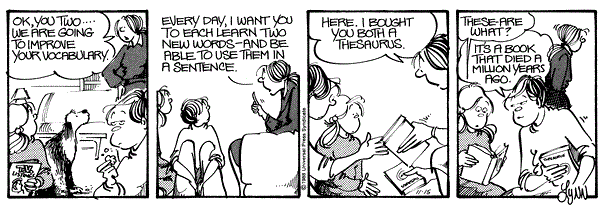
Back in the olden days of Dinosaurs when Encyclopedias were bound in book form (Yet weren't called Thesaurus, since that name was already taken), the Internet as we know it hadn't been fully fleshed out for it's potential in porn, so if you missed a comic in the Newspaper, the only way you could find out was if the paper was generous enough to print an explanation the very next day, if enough complaints happened to reach their headquarters.  More often than not, papers weren't as generous with explaining any potentially confusing comics, unless they'd been given advance warning for excluding certain potentially controversial comics, such as Lawrence's Gay Reveal, or Doonesbury's multiple political subjects.

An example would be this Blondie, which ran on December 12, 1990:

At first glance, halfway through the comic, the scene shifts away from Dagwood talking to Elmo, to suddenly getting out of a Taxicab with his Boss.  The explanation is these are actually the setup to two different comics accidentally combined together without any comprehension, rhyme or reason.  It was basically Randomized Garfield before Randomized Garfield existed.  To make matters further annoying, the latter strip was printed in full the very next day, but gave no resolution to the previous strip.  I didn't get to find out what the punchline was until over twenty years later.  You're luckier - you can just compare and contrast with the full comics below.

Another Blondie mistake can be seen below:

At first glance, Dagwood screaming seems to be the punchline, with what looks like to be a rather weak setup.  But if you rearrange the above and below panels around, the sequence will make more sense.

Of course, panel mixups in Newspaper comics is nothing new.  But there's also the aspect of misplacing entire comics entirely.  To give an example of this, here's a cutaway view for January 1, 1990 and the surrounding comics.

Now, here's the comics page three days later on January 4th.  Can you tell the difference?  Or rather, what's stayed the same?

For some reason, they reprinted Calvin's Monday comic on Thursday.  It took me until the Comic Collection Scientific Progress Goes Boink to find out what actually happened.  For some reason, Calvin dousing Susie with a domino Snowball was considered more acceptable than assaulting her with a shovelful of snow.

There were other instances where comics had the order they were supposed to appear switched.  In most cases, this had no effect whatsoever with their story.  For instance, here's the Adam that appeared on July 12, 1990, when he was exercising in a Gym that had Babysitting services, which he took advantage of:

And here's the comic that appeared the day after.  (Side note, the latter was in a book collection, but the former wasn't)

But here's how the comics page appeared on November 13:

As you can see from the above comics Garfield & For Better & For Worse, the dates are ALL for July 13th, but the Adam strip is for July 12th.  Which means the headphones were handed back to Adam After he took decided to use them for marketing purposes.

But these are minor nitpicks aimed at daily comics that are for the most part, pretty self-contained.  The one comic I most wanted to point out that fell prey to this kind of slipshod maneuvering that has a story arc that is certainly infamous around Internet comic circles.  Particularly around October 23, 1989.  But you'd never know that from the innocuous opening here:

Okay, so apart from Elly crashing her car, there doesn't seem to be anything entirely out of place.  But that wasn't until the very next day that a certain sense of wrongness seemed to manifest itself:

A 4-panel Garfield comic?  You hardly ever see those happening.  It's closer to a Sunday comic if anything.  And Garfield's character design seems to harken to his earlier draft.

By Wednesday, Gerfield reverts back to his familiar design, which is actually a rerun.  For some reason, Marmaduke seems affected as well.  It shares the same date - September 3rd.  Whether there was a similar controversial theme happening there, it doesn't seem to be obvious.  It wasn't until Thursday that I got the sense that there was something very wrong happening here:

Yes, you read right - I got a bunch of unrelated out-of-sequence Garfield comics on the one week when it was vital that they arrive in order; meaning I missed out on all the setup to Garfield's infamous Halloween sequence.  Fortunately, after this horrendous misstep, there doesn't seem to be any more noticeable mistakes on the Comics Page (that I can recall), but this is the one that stuck in my craw the most.  This was bigger than missing out the punchline to a nonessential daily strip.  This was getting the setup to what was essentially an actual horrorshow from one of the tamest enjoyable comics in the Funnies.  And I didn't get to experience it on a daily basis.

Just what editorial decision led to replacing the essential Garfield comics for this week without any preparation or fanfare, I can't imagine.