I wanted to repost some of my thoughts I made when Valerie D'Orazio looked back at the debut of Image comics and the rise of such stylized "artists", like Rob Liefeld:
The interesting thing is - I thought that American comic art was supposed to look ugly. I'd grown up reading Newspaper comics and Archie/Harvey books, and the stark contrast between these two styles always confounded me. I couldn't even distinguish one artist from another - and that's including the Archie comics. In my mind, all "realistic" S-hero art was supposed to look unfocused & scratchy. (This was certainly apparent when the Archie Ninja turtles had differing art styles, and I had trouble focusing on any one, since it changed all the time)
It wasn't until I read DragonBall that I was finally able to distinguish one art style from another. Of course, I only entered American comics not around the time Superman "died", but when he "came back to life". I'd never even heard of Liefeld before everybody started hating on him before, and wasn't even interested in anything the Image guys did.
The point is, I was better able to identify with clean artwork than straight-up realistic versions of people. For some reason, fans are utterly devoted to portraying S-heroes this way, even though media has shown otherwise. (Mario surpassed Mickey Mouse in popularity at the time of his debut)
I also posted a comment about the history of the Image founders that I can't find right now, so I'll recreate it from memory. Basically, the whole reason Image was created was that there were a group of artists who'd gotten popular by drawing various S-hero comics for the regular comic companies, Marvel & DC. They'd grown dissatisfied with the current crop of comics they were drawing, and wanted to branch off into stories they wanted to tell.
So they broke off, and founded their own company, Image. And they produced... S-hero comics. Only with guns, skin and hyper-violence. All the stuff that they couldn't show within the more restrained family-friendly comic companies. Image now has more variety, with other indy-based stories, but the stink of their foundation has still stuck with them. When your main audience is the S-hero crowd of the direct market, there's not much room for experimentation there.
Conversely, in Europe, there were a group of cartoonists who'd grown dissatisfied with the current crop of comics currently being produced, so they broke off and formed their own company, L'Association. And they produced... comics such as Dungeon, Epileptic, and helped Marjane Satrapi create Persepolis. Quite a far cry from Image's concept, even though they had similar intents. (And those are only the titles that've been brought over & translated here)
Also, an interesting alternative regarding the Liefeldian woman with looooooong legs - it's easily comparable to how Shojo artists tended to portray their leads. Not just the women, but the men had legs that were longer than their upper bodies. Just flip through any random page of Swan or Eroica, and you'll see what I mean.
For those of you not in the know, the long-running Glass Mask is the Manga that's influenced the modern-day Skip Beat! This was one old-school Manga I was hoping CMX would pick up before they went under. Every day, I browse AnimeNewsNetwork in the vain hope that this series will be licensed. The updated Anime version has been released, but for some reason, I prefer the old-school version.
Here, Maya of Glass Mask fame is binding up her leg to better portray a limping hospital patent. Even ignoring the fact that her bellbottoms are obscuring the lower part of her feet, bending her leg like that should have it extending enough to touch her hair behind her back. (Get a ruler, do the math)
Granted, this is more of a stylized choice, and such things only become obvious upon multiple readings. Of course, this isn't limited to just Shojo Manga: Keisuke Itegaki of Grappler Baki fame also has a tendency to go overzealous in his portrayal of the male body. ALL of the men in the Manga are overly muscled to anatomical proportions, and their feet are usually perpendicular towards the botom of the panel. His telltale artistic shortcuts are detailed whifts of smoke/dust of the fighter's actions, baggy clothing to hide their limbs and the dramatic lack of detailed backgrounds.
As one reviewer of the series said, "While most Shonen titles are about fighting with various side stories sprinked throughout, Grappler Baki is weird in that it's only about fighting. The characters are more interested in defeating someone and being defeated in their belief that it'll help them grow stronger."
When a forum topic asked between Liefeld & the Baki artist who would be better suited for drawing their autobiography, several readers preferred the former. While Keisuke may be the Liefeld of Japan, he differs in that his work is at least enjoyable on a Fletcher Hanks level where you're rapidly flipping through the sparsely worded pages to see what'll happen next.
Of course, these all pale in comparison to an extra in W Juliet where a printing error had the male character's leg extended ALL the way to the bottom. The assistants couldn't stop laughing.
This is a site devoted to casting a spotlight on those comics in the Sunday pages that for one reason or another, were never collected. Also, I'll be paying attention to other comics worthy of wider recognition.
Tuesday, September 28, 2010
Friday, September 24, 2010
Sibling Revelry
My newspaper changed how their comics were shown at least three times. First, they were bound in a format not unlike a regular pamphlet/floppy, of 16 pages with a random children's drawing on front. Then they were collected in a flimsy 8-page larger format, larger, but with fewer comics. Finally, they settled on a 2-3-page newspaper page which they've stayed with to this day.
When they changed to this in the 1990s, I also got to save some of the Saturday comics that were printed on the back of the Sunday comics. (Not all the dailies we got had Sunday components) One of which was the largely unknown comic, Sibling Revelry.
Like its name suggests, it's a partial play on the term Sibling Rivalry, only more for taking joy in the interaction. One could suggest that the two children are more interested in fighting each other than actually bonding. As I'm sure everyone who had to live with another older/younger child, their fondest memories are of extremely memorable argumentive fights they had with their brother(s) / sister(s). Mine is the fights I had with my sister over whether the blinds should've been drawn down. (Don't ask)
The main cast consists of Lori, the haughty older sister and Stew, who's been cursed with his father's good looks, and has a nose bigger than Adam. (I may do a future post about his early strips)
There's also the exasperated mother...
...and later, their grandfather who was shown for a grand total of two weeks before being shuffled off in favor of the kids.
There's also the token Black Best Friend. I don't know more about him than this single strip here. Sorry. (Then again, black friends aren't usually further developed than to show some exotic appeal and appease racism. For all the times we've seen Lawrence & Marcus, we know very little about them)
I don't remember too much of the dailies, since they weren't collected, but this strip could use some further explanation. Stew went to the trouble of stealing a candy bar, then felt extremely guilty about it and decided to run away from home. It was only after he took a closer look at the candy bar he stole and noticed it had the label, "Free Sample".
Part of Stew's many schemes were plans to get back at his sister, which usually backfired on him.
Not that he would be able to succeed, since Lori was much more sophisticated than he was at doling out punishment.
Given how intimidating his sister was, this strip is an amusing reversal.
Inspired in part by threemeninatub's posts on NutherWorld, I figured I should pay tribute to good comic strips that languish in obscurity. These are all the Saturday strips I was able to get before it was replaced by Sally Forth. Why this kind of comic never caught on, I'll never know.
Labels:
Comics,
Newspapers,
Sibling Revelry
Tuesday, September 21, 2010
Lucky Eddie Origins
Despite being part of Hagar's home life with his intellectual son, amazon daughter, and overbearing wife, we don't know much about Hagar's best buddy / crewmate.
After a certain amount of time, creators may feel the need to explain the most basic elements of a long-running comic character, such as Superman emitting Super-hypnosis through Kryptonian glasses to appear as frail Clark Kent. Or revealing Songoku as a space alien to explain how he could keep fighting despite being hurt and having a monkey's tail. Uderzo may have butchered the Asterix line with his latest atempts at storytelling, but at least he hasn't tried to explain why Asterix wears those expressive wings he wears on his helmet. (Goscinny did tell how Obelix fell in the Magic Potion though)
However, daily Newspaper comics don't have to concern themselves with continunity, since consistency is more important to their readers. So a new element can be revealed about a character without actually changing or contradicting anything that's already been said.
Sorry about the quality of the strip here. This was before I learned how to repair book bindings (I was still 10, gimmie a break), and I figured that even if the quality was lousy, I could still remember the original content. It never occurred to me that I would be sharing it with other people years later. For those of you unable to read the first panel, Hagar is saying, "Sniff that good old mountain air Lucky Eddie." Likewise, in the penultimate panel, Hagar is asking, "Really? Did he ever give you any free stuff Lucky Eddie?"
Even though he's always called Lucky Eddie, the meaning of his name wasn't apparent to me until this strip. (Don't worry, he gets better.) The nature of his bad luck might've been alluded to in previous strips, but until it was pointed out here, I wouldn't have picked up on it otherwise. After all, when you think of suffering, it's Hagar at his wife's hands. (Depending on the context, he usually deserves it)
Labels:
Hagar
Friday, September 17, 2010
Wayside Difference
Everybody knows about those ridiculously awesome Sideways Stories from Wayside School by Louis Sachar, right? (If you haven't, you've missed out on 30 stories of goofy goodness) For those of you who remember these nonsensical stories (one for each floor), you might've noticed a slight difference between the cover and the first chapter.
For the less observant among you, can you spot the major difference? It's not the lack of a blackboard in the background, nor the shape of Mrs. Gorf's smile. It's not even the slight difference in the outlines, nor even the fact it's in black & white.
Give up? Already? Boy, you people have it too easy. Here's a page by page comparison:
As you can see, the boy's grown an additional opposable thumb. Apparently, the dreaded six-fingered disease isn't just limited to Manga characters.
Labels:
Children's Books,
Manga
Sunday, September 12, 2010
Romance? I think I’ll cry!
At precur, where I made a lengthy post about the unfair hierarchy of respect between men & women’s literature, and it started me thinking about the differences between American Romance and Japanese Girl’s comics. Although Harlequin Romance gets no respect on these shores, it’s still a perennial bestseller despite (or because of) their cookie-cut plots.
My knowledge of what happens in the interiors of Romance comics is severely limited to what I’ve seen on the web, but I know they tend to follow a basic formula. Woman sees man she likes. Obstacle (class differences/love rival/natural disaster) intervenes. Woman angsts. Man admits foolishness on his part / woman realizes her mistake. Happy End! I’m sure there are more intrigues involved, but given the majority of Romance comic plots were 6 pages long, there’s not much room for subtlety there.
Where Romance comics covers are filled with crying women, Japanese comics in contrast have happily smiling girls. At the time, I wrote, “Great marketing technique there – who’d want to buy something where the girl is always sad?”
The difference is, while the outside Manga cover may be featuring optimistic girls, on the inside, they’re filled with inner turmoil. Here’s the cover to the 7th Nana volume, which is the turning point early in the series’ run. And the smiling protagonists just belie the events that transpire within.
Likewise, here’s the 6th cover to Kitchen Princess, and a fairly traumatic event happens within these pages.
The Japanese covers are just a tease without any of the inner demons that lurk within. While American comics show a conflict that’s easily solved with. So which is the better one? Myself, I think the Manga versions are a metaphor for how women feel. On the outside, they may be all smiles, but in the inside, they’re crying.
When I was doing research of Romance covers, I thought it would be easy to find plenty of examples of crying women. Imagine my surprise when I found that there were more covers of the women kissing than crying.
This is probably the happiest Romance comic cover I could find, which is pretty sad if you think about it:
Labels:
Comics,
Manga,
Weird Romance
Thursday, September 9, 2010
Samurai Mishaps
I wanted to blog something lighter after my massive Wedding post, so I thought I'd point out a few mistakes in some of Dark Horse's Samurai Manga.
As much as I appreciate Blade of the Immortal, I'm still waiting (perhaps in vain) for the day that they'll publish larger-sized unflipped versions of the series. Part of the reason is that I feel reluctant to pay top dollar for some of the thinner volumes, such as On Silent Wings (Vols. 4-5), and Beasts (Vol. 11). Not to mention that they changed the title of the 12th Volume from Fall Frost to the more cumbersome Autumn Frost. (This was similar to how they changed the last volume of Lone Wolf & Cub from Falling Tree to The Lotus Throne).
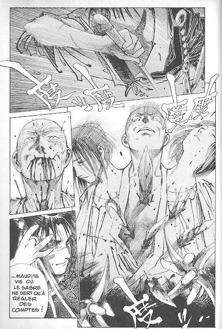
When I compared the Dark Horse version to the French translations, there were two things that stuck out for me. One was that the French version was more faithful to the Japanese version. The other was how subtle lines were clearer in their printing. The major sticking point is where Rin confronts her Father's killer, Kuroi and he turns around. In the Dark Horse translation, the whole page was flipped, which was very jarring on the opposite page. Here's the French version:
However, sometimes the French version was too faithful, which led to panels like this:
If read from left to right, you've got a sword swing, Kuroi spouting blood, a speech from Manji and swords sticking out of Kuroi's body. (Kuroi's mouth is surprisingly blood-free) As a result, you've got pages where you read dialogue one way, and pages where the panels are read another way. This was corrected in future editions, but it's an example of how faithfulness and comprehension of the Manga market wasn't easily understandable back then.
The other example I wanted to point out was where Manji notices a tree branch moving after a spy had leapt off it:
But in the Dark Horse version, you can barely see the motion lines evident:
Until they correct those things, I'll hold off buying my copies of BoTI until later. Sadly, they may never publish omnibus collections. At least not until Hiroaki Samura's finished the damned thing. Every year or so, he claims that he's currently producing what'll be "the last arc", only for it to be a setup for the next finishing arc. But I'm not complaining. The major reason may be that if they release it unflipped, there'll have to be a lot of dialogue that'll have to be retweaked and moved around. The best example I can think of is this page; where after Manji & Magatsu confront each other again, the houseservant walked in, creating an uncomfortable situation.
Originally, she asked if they were trying to kill the mosquito. When they confirmed, the next page had her saying, "With swords? You guys are both nuts!" It's not hard to see why they would prefer their version.
However, there were times where Dark Horse accidently printed some pages unflipped. Here's a few silent pages from the sixth book of Samurai Executioner:
If you read the images backwards one page at a time, it's obvious that the prisoner for some reason is planting a flower in front of the execution hole. Otherwise, it looks like he's planting a flower, only to dig it up again later. The biggest clue that something wasn't kosher was when executioner Asemon walked through the gates and the guards politely bowed to him.
Part of the reason for the confusion might be that there were no word balloons to indicate direction. A bigger reason could be that the flipped version shows the man's head turned in the same direction as the unflipped pages.
Of course, even dialogue balloons can have silly little mistakes. Here's an example from the first volume of Lone Wolf & Cub where, like every other manly protagonist, he lets himself get beaten up to prove how tough he is. Notice anything out of the ordinary?
I'll give the answer here - the balloon where the sadist is knocking Ogami Itto around is a punching star balloon, not a shouting balloon. The results should look more like this:
I pointed these mistakes out to Dark Horse headquarters two years ago, and they said it would be corrected in future printings. I have no idea if they've done so, since everything's shrinkwrapped. Maybe somebody out there could check?
As much as I appreciate Blade of the Immortal, I'm still waiting (perhaps in vain) for the day that they'll publish larger-sized unflipped versions of the series. Part of the reason is that I feel reluctant to pay top dollar for some of the thinner volumes, such as On Silent Wings (Vols. 4-5), and Beasts (Vol. 11). Not to mention that they changed the title of the 12th Volume from Fall Frost to the more cumbersome Autumn Frost. (This was similar to how they changed the last volume of Lone Wolf & Cub from Falling Tree to The Lotus Throne).
When I compared the Dark Horse version to the French translations, there were two things that stuck out for me. One was that the French version was more faithful to the Japanese version. The other was how subtle lines were clearer in their printing. The major sticking point is where Rin confronts her Father's killer, Kuroi and he turns around. In the Dark Horse translation, the whole page was flipped, which was very jarring on the opposite page. Here's the French version:
However, sometimes the French version was too faithful, which led to panels like this:
If read from left to right, you've got a sword swing, Kuroi spouting blood, a speech from Manji and swords sticking out of Kuroi's body. (Kuroi's mouth is surprisingly blood-free) As a result, you've got pages where you read dialogue one way, and pages where the panels are read another way. This was corrected in future editions, but it's an example of how faithfulness and comprehension of the Manga market wasn't easily understandable back then.
The other example I wanted to point out was where Manji notices a tree branch moving after a spy had leapt off it:
But in the Dark Horse version, you can barely see the motion lines evident:
Until they correct those things, I'll hold off buying my copies of BoTI until later. Sadly, they may never publish omnibus collections. At least not until Hiroaki Samura's finished the damned thing. Every year or so, he claims that he's currently producing what'll be "the last arc", only for it to be a setup for the next finishing arc. But I'm not complaining. The major reason may be that if they release it unflipped, there'll have to be a lot of dialogue that'll have to be retweaked and moved around. The best example I can think of is this page; where after Manji & Magatsu confront each other again, the houseservant walked in, creating an uncomfortable situation.
Originally, she asked if they were trying to kill the mosquito. When they confirmed, the next page had her saying, "With swords? You guys are both nuts!" It's not hard to see why they would prefer their version.
However, there were times where Dark Horse accidently printed some pages unflipped. Here's a few silent pages from the sixth book of Samurai Executioner:
If you read the images backwards one page at a time, it's obvious that the prisoner for some reason is planting a flower in front of the execution hole. Otherwise, it looks like he's planting a flower, only to dig it up again later. The biggest clue that something wasn't kosher was when executioner Asemon walked through the gates and the guards politely bowed to him.
Part of the reason for the confusion might be that there were no word balloons to indicate direction. A bigger reason could be that the flipped version shows the man's head turned in the same direction as the unflipped pages.
Of course, even dialogue balloons can have silly little mistakes. Here's an example from the first volume of Lone Wolf & Cub where, like every other manly protagonist, he lets himself get beaten up to prove how tough he is. Notice anything out of the ordinary?
I'll give the answer here - the balloon where the sadist is knocking Ogami Itto around is a punching star balloon, not a shouting balloon. The results should look more like this:
I pointed these mistakes out to Dark Horse headquarters two years ago, and they said it would be corrected in future printings. I have no idea if they've done so, since everything's shrinkwrapped. Maybe somebody out there could check?
Labels:
Manga,
Pet Peeves
Subscribe to:
Posts (Atom)