Wednesday, May 9, 2012

Maurice Sendak is Dead

Yesterday, famed and beloved children's artist (though he was loath to use that term, as pointed out in this Spiegelman representation) died of a heart attack. It was somewhat of a surprise, since I didn't even know he was still producing more work, since the last book of his I saw in the bookstore didn't quite capture my imagination. Still, he must've been doing something right, since his last publication (until the vultures mine his notes for unreleased material), Bumble-Ardy, wound up to be another bestseller. Even if additional sales turn out to be from spectators who drive the numbers up by snatching up an artist's postmortum works, that still doesn't take away the power of his previous books. Even when his latest books failed to catch the public eye or attention, he didn't care. He was perfectly content to keep producing new material as long as somebody out there would read it.
http://a4.sphotos.ak.fbcdn.net/hphotos-ak-snc7/582163_10151092905325620_528740619_13228589_1412135671_n.jpg
My tribute to the man will be through these pictures from the first volume of the Childcraft How & Why Library, Poems and Rhymes. Since Encyclopedias are likely to go out of vogue with the ever-increasing reliance of the internet and wikipedia (though ironically enough, there's an entry about Childcraft there), it's probably prudent to show some of Sendak's artwork here, even though it doesn't seem as inspired as his other stuff.


While most children's artists would be content with rehashing familiar Nursery Rhymes such as Mother Hubbard or Mary had a Little Lamb, Maurice Sendak would go for much more obscure fare, such as Hector Protector, Higglety Pigglety Pop!, and We are All in the Dumps with Jack & Guy. His imaginative illustrations and interpretations of these nonsense verses make me wonder what other artists could make out of the rest of the unused Mother Goose stuff? There's a whole bunch of Nursery Rhymes that's hardly seen the light of day that could use a second look. Surely there should be other children's illustrators willing to take the chance to plunge into uncharted territory just like Sendak did. It would be the ultimate tribute.


Of all of Sendak's books, my personal favorite is probably Some Swell Pup; Or Are You Sure You Want a Dog?, even though I don't quite like dogs myself. The interior is quite close to a comic book mold itself, even though it's considered to be a lesser version of either Where the Wild Things Are or In the Night Kitchen. But I don't care. I've always had a skewered opinion of things contrary to the public at large, and I'm sure Sendak would've felt the same way.


One thing that I always was confused about growing up was why there was never an animated version of Where the Wild things are. I'm not talking about the recent live-action movie, but of an animated clip where Max (who looks suspiciously like Montana Max from Tiny Toons) races the dog through out the house before getting into trouble. It would be years before I found out it was an early Pixar attempt that was cancelled during production.

Now, I just need to find that animated commercial that used the character designs for the creatures from Where the Wild Things Are, and several barefooted children (which bypassed Sendak's inability to draw feet). If I could just remember what they were advertising, I could easily narrow it down. I recall something involving a lemonade stand, running out of merchandise, and grumbling children. There may have been a boat involved. Yeah, I know it's not very helpful, but it's all I've got. Until I did some research, I had no idea that there was a National Film Board adaption of Higgedly Piggedly Pop! It's apparently available as a bonus clip on the Where the Wild Things Are DVD.


Until the man died, I had no idea that he was a second-hand Holocaust survivor (), or that he was ousted as gay later in life. But even if I'd known these things, it wouldn't have changed my opinion of his books much. They were either interesting to look and re-read, or they weren't worth opening in the first place. Sometimes they were the former, sometimes it was the latter, mostly the more serious artwork or text-based stories.


For people who already miss his stylistic worldview of mean children and real monsters, take comfort that Maurice Sendak's spiritual successor, Mercer Mayer is still alive. Of course, given that the Little Monster artist is pushing 70 by now, that may not be very reassuring.


Chances are, you're finding that these Childcraft drawings are quite tame, and look phoned in, which wouldn't be too far from the truth, since they're quite restrained given the contents of the songs or poems they're representing. In addition, there's two pages devoted to Christian prayers, which may seem surprising, given that Sendak was Jewish, but it's not unusual for creative artists to create work that falls outside their religion to get a paycheck. Yet these pictures still retain a certain amount of quality to them. To make up for the lack of scary themes, here's a tribute that I'm surprised hasn't made its round among the internet yet.


EDIT - something that just occurred to me after rereading Down in the Dumps - there's a possibility that some of Sendak's inner turmoil after discovering he was gay late in life was expressed in Jack's rage after he was kissed in appreciation by the "poor little kid". It's unknown to what extent that Sendak put his personal issues in through his works aimed at children, but it seems somewhat fitting that such a theme could be presented and passed by without commentary for years. For a book that's rather sparse in its usage of words (though extra lines are spouted by the nameless cast throughout the lyrics), there's an amazing amount that can be gleamed from those few sentences alone. The pictures making up the bulk of the story is just another added benefit that allowed a singular design to pass by unnoticed and be scrutinized by critics trying to delve some deeper meaning through their actions, even though his intent may have been just to amuse children. No wonder Sendak said that he never created children's books, even though they contained the guise of same - adults kept trying to understand the man's work, since they represented a childlike sensibility that was long since forgotten.
'Come', says Jack, 'let's knock him on the head.'
'No', says Guy, 'let's buy him some bread.'

Saturday, May 5, 2012

My Secret Shame

There's something that I regularly do after posting my entries that I'm not entirely proud of. Shortly after I post my latest blog updates, I'll suddenly think of something I left out, or another relevant comic, and I'll scramble to write up, or find said image to put into my post, and hope not too much time has passed for anyone to notice. I have entire concepts mapped out in my head with the intent of capturing them down creatively, but when I get around to it, I find that I've lost most of the arguments and analyzations that seemed so clear at the time. Very often, my creative juices are inspired by which images I choose to upload, and they're hampered just as easily, because I figure the comic in question is all the explaination I need. Other times, I'll find comics that I completely missed or forgot about that I didn't get the time to scan properly, and I have those taking up space in my folder just waiting for a revival. I could go back and update those links, but chances are they won't be noticed, and the only chance they have for wider distribution is if I make them the main focus in my latest entries.

Here's an appropriate finale for the Shoe sports scores:


Here's another image that could've been perfect for my Barber / Dentist preferences.


There was another thin-related comic that I'm sorry I didn't get the chance to post when I had the opportunity.


I found a few more tax related comics, but those can wait until next year, assuming the world will survive the Mayan prophecy of 2012. (Logically speaking, I know I shouldn't be so superstitious, having lived through Y2K, which I still affectionately call the Yuk-2 bug, but I never let a good worry go to waste)

So far, the one I most wanted to add to was my critique on restaurant menus. I intended to show a review of Vichy's, but couldn't find it online, presumably because it originated in 1995, and anything before then wasn't considered worth archiving.


I recently went back to that buffet restaurant to celebrate a momentous event, but it was hampered because I wound up eating too much again, and had to walk around quite a bit in order to burp up some air and free some room for desert. However, even that little exercise wasn't enough to completely empty the contents of my stomach, and I wound up barfing up some portions of the tasty chocolate mousse I'd devoured, making my little ritual quite pointless. When you're regurgitating the stuff you've already swallowed in order to make room, that's more of a sign to stop eating, unlike the residents of the Capitol in The Hunger Games.


My Zaidie would always say that he was full after eating supper, but at the mere mention of desert, would have a sudden change of mind and announce that he could afford to "fit a little more room there". Even though I always had a lot of trouble understanding his Hungarian accent, I'm surprised at how much I'm told that at times I say things that sound remarkably like they came from his mouth. Like my grandfather, whenever anybody mentions something memorable around the dinner table, I'll remark "That reminds me..." and I'll either regale a funny comic or newspaper article I read years ago, and it'll EXACTLY fit what we're talking about. Likewise, my Zaidie would recall anecdotes or stories that he heard years ago, and the theme would be a perfect representation of the current subject.

Another problem I have with my posts is that they have a tendency to end abruptly once I've finished my main topic. I feel like I should give a more satisfying conclusion to my observations, but the overall effect is somewhat lacking. Likewise, there are some sentences that sound perfectly elaborate, but I have nowhere to put them, because they'd ruin the flow of the paragraph structure. Can you guess where this line was originally supposed to go? "The problem is, the food is so tasty that I want to experience the taste more than anything else, but I can't take any of the buffet stuff home with me, since they don't have a doggie-bag policy, and I hate to waste perfectly good food on my plate." Now, with some creative writing, I probably could fit it in, but I'm constantly distracted with my blog saving every minute or so, which plays havoc with my concentration.

Thursday, May 3, 2012

Red Ketchup in Antarctica

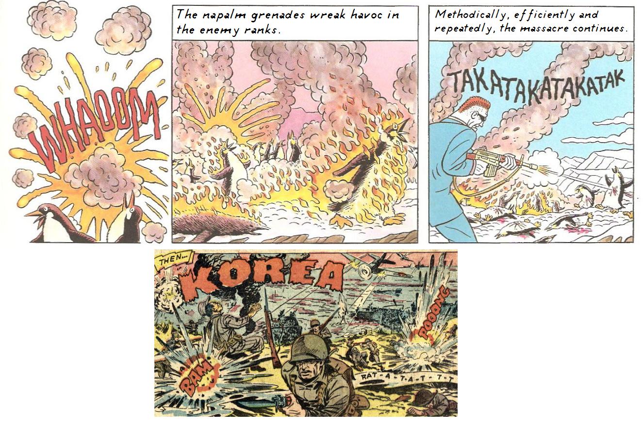
Here's the first half of the second Red Ketchup book, Ultra Kamarade. Like Cerebus and The Sandman, the second collection of Red Ketchup was released first, because it was considered the better representation of the character, compared to his first impression. Considering the lukewarm reaction to the first book, I'm guessing the second one will be better recieved, even though I practically spoiled everything that happens in my mini-review.

Originally, I was going to wait until a certain amount of time until I finished the whole book, but both I and my translator LeChatVert have been too busy with other personal stuff to get around to it. If there's stronger demand for more, we'll probably devote more time to the project. No promises.

The other reason was that I was hoping that a certain image of mine would come up first.
When Mike Sterling was giving additional comic examples from his Then... KOREA blog topic, I was inspired by some of the other reader's entries to submit my own try at the mash-up. Although I'm only mentioned by my first name, I can assure you that Funky entry is mine. However, now that he's reduced his daily entries after his computer scare, and there doesn't appear to be any more Then... KOREA entries, I might as well show you what was my intended second entry:


Before giving the download link, in light of the upcoming CISPA (Cyber Intelligence Sharing and Protection Act) which is considered the next SOPA, here's a mandatory warning message from our unfriendly FBI representative, giving what is probably their least effective detractive tactic.


You have been warned. If penguins worldwide go extinct, it's all your own fault.

Tuesday, May 1, 2012

Come What May


If I haven't been posting as much as I'd like to this past week, I'd like to apologize. I've been feeling slightly unmotivated lately, what with having sudden changes suddenly implemented on me. They're not the kind of life-shattering events that normal people would be affected by, but subtle changes in my routine have left me shaken and uncertain, and my responses have been muted to the point where any potential outburst of creativity that's not acceptable has to be stifled.


It may be making me more acceptable to the outside world, but it's killing me inside.


This was one of the few comics that I had to have explicitly explained to me for why Michael was so interested in having more storage room in the back, and it had nothing to do with wanting to carry around extra-large ear-splitting stereo systems. For anybody who doesn't get this, feel free to ask your parents and enjoy seeing their reactions.

Go ahead and ask even if you DO know the answer.


Here's another target for further proof that Lynn Johnson piling the resentment towards April, since her presence was threatening to interfere with the "destined" Liz/Anthony true pairing. Frankly speaking, April should've stuck around more often, prompting Elizabeth to move away from her snoopyness, and find potential love interests elsewhere. This is kind of ironic, since it's the very same tactic that Elizabeth pulled with her own brother.


Then again, it's likely that April is another extension of Lynn Johnson, where she would tease her relatives by knowingly staying in the same room while they were out with their friends so she would bug them. So in a sense, you've got an avatar of Lynn betraying the convictions of another avatar of Lynn, infuriating one to the pleasurement of the other. It's a win-lose-win situation.


A condensed version of this strip, only with proof of bouncing a basketball off the garage rather than the side of the house. For some reason, the basketball is dirty enough to keep specks of dirt on all sides with every bounce. They must be dropping it in the mud or something.


Might as well close out this rather uneventful month with a playful romp with the kids.


When I first saw this, I tried to envision what possible strip it could've been influenced by, and what the preceding panels would've looked like. John must've gone through some wild contortions in order to put himself into that position.

Sunday, April 29, 2012

That Reminds Me...


I rather liked Thursday's Bizarro comic, since it certainly reflected on a certain trait of mine - I have a notoriously bad memory for things that aren't written down. Since I'm deaf, I have a terrible auditorial memory. Things literally go "in one ear and out the other". I much better remember things if they're written down instead. I live among the way of thinking that "If I don't see it, it doesn't exist". This is further impounded by my daily experiences, when I'm introduced to who I think are new people, and then I'm told that I've met them before. I practically forget anybody I don't meet regularly over a two-week period, and am constantly amazed that there are people who can remember someone they haven't seen in years. I once did a presentation for a teacher who hadn't seen me since kindergarten, and she said she recognized me from my eyes alone. Considering that people's eyes don't change much throughout their lives, it's certainly a handy reference, but I'd still find that an insurmountable challenge. I'm usually too focused on the person's lips or face, and the outfit they're wearing. If they change their clothes or shoes on a regular basis, I'm in big trouble.

Getting back on topic, I have a tendency to leave lots of scraps of paper containing my notes or story ideas lying around, which doesn't sit well with my residents, since they're forever complaining about my creating a mess. But I thrive under these conditions where I have multiple concepts strewn about in a seemingly haphazardous manner that's actually an organized mess of spontaneous creativity, and can combine two ideas that normally wouldn't be considered otherwise. (This is mainly the inspiration for several of my mash-ups I've done) When I can see certain visual reminders, I don't have to struggle to keep every single thought running in my head reminding me to do certain things all the time. I used to keep a post-it-note at the front door to remind me to turn off the outdoor lights if I woke up early, but it was taken down because it "looked ugly", and I eventually forgot about it.


Alternatively, when I don't see some notes after awhile, when I see them again, it jogs a creative bank in my brain that fires it up for potential possibilities. One such example would be a single sentence consisting of "Midas = Pt", which inspired the following story below:

A King's Wish

Once upon a time, there was a king who loved nothing more than gold. He was surrounded by gold. His bed was made of gold, his crown was made of gold, his throne was made of gold. If there was anything that wasn’t made out of gold, it soon would be.

The God who’d granted the king his wish saw his torment, and popped out from wherever he’d been hiding and watching the king in the first place.

God: (amused) Well, are you enjoying the gift I’ve bestowed you?
King: (despondently) Not as much as I thought I would. I’ve never realized how garish so much yellow around the palace looks.
God: (factual) Well, that’s the price you pay.
King: In addition, I'm going mad with hunger, because everything I pick up, even with another golden instrument turns into gold the instant they touch my lips.
God: Well yes, you didn’t exactly specify on any restrictions or limitations for your wish.
King: To make matters worse, my powers wound up alienating my entire staff and family, save for my daughter who stayed behind, only to turn into a solid gold statue right before my very eyes.
God: (annoyed) I already know all this. I saw it happen. I’m offering to -
King: And with so much gold around, it’s actually driven the value of gold right into the crapper. I now realize that there are more valuable things on Earth than just shiny yellow metals.
God: (Impatiently waving hand) Yes, yes get on with it. What do you want instead?
King: I want everything I touch to turn to platinum.

A few days later, there was a castle made entirely out of platinum with a platinum throne containing a skeleton with platinum robes, staring at a statue of a platinum girl. For some reason, the smile on the skull beneath the platinum crown looked content.

The flip side of this strategy is that I'm notoriously nervous about reviewing my notes because I'm nervous that any of my old writings or ideas might not be as good as I thought they might be. Also, there's a LOT of stuff I've written down, and it's somewhat of a struggle to go through all of them, because they're so personal. If I read a particularly emotive sentence, I'll have memories of what I was thinking when I wrote it, the emotive state I was in when I wrote it, and the event that influenced it. I can't remember people I've met a month ago, but can remember the psychological state I was in when writing something. It's a lot to take in all at once, and I have to dillute it through a strategy of winding down by pacing around the room, preparing a little snack, or watching a show I've taped. Practically any procrastination skill that'll keep me from going over my old stuff.

Usually, my first outlet for avoiding such deeds is the addictive allure of V-games. The adrenaline factor I get from trying to collect everything and get 100% scores is the only thing that makes me feel truly alive. So far, Angry Birds is the first Video Game I've played that actually makes me want to procrastinate myself to do some actual writing. The puzzles are so touch-sensitive and repetitive, that it's actually counterproductive into convincing me to keep playing that I want to do anything other than destroy every building block. Savestates would be a bigger help into keeping me playing, but I'm not sure if I'd want to bother.

A better motivation for spurring my creative juices is having a deadline to produce such works at a time they're available. Another is having a specific topic to work from. All I need is a little push in the right direction and I'm good to go.

Of course, this system of having everything in plain sight has a certain drawback. Being constantly surrounded by the covers of my favorite books means that I'm constantly reminded of what the contents are. I already know what the punchline will be before I even get to the end. However, my memory for newspaper Sunday comics only peters out at 1996, when Calvin & Hobbess retired, and the number of readworthy comics in the paper continually declined. The best way for me to be continually surprised by a story I've read is to hide it somewhere out of sight, then come across it again unsuspectingly, reread a relevant passage I'd somehow long forgotten, and be pleasantly surprised by the results.

Wednesday, April 25, 2012

Lament for Neglected Extras

For the 85th Anniversary of Asterix, some scans were recently released in conjunction with some author’s interpretations of the famous gauls in the form of two books: Asterix & his Friends and Uderzo. However, these scans were drawings that were only hinted at, but never shown fully in the Asterix and the Class Act album.


This brought up a certain complaint of mine that I have with some reprint licensed properties - sometimes not everything is published from the original comic. In a lot of European comics, there are some pages that are left out to save on publishing costs, such as in a collected omnibus that’ll give the customer more bang for their buck, they’ll leave out the other covers of the original volume, and only choose one. On the one hand, it’s a fair marketing move, but it still saddens me that there’s some artwork that’ll otherwise go unnoticed, save for the fanatic few who insist on having multiple copies of the same book in various languages to get that ‘authentic’ feel for the product.


The original covers for David B’s Epileptic (L'Ascension du haut mal) started out with the autobiographical subject as kids that eventually grew older with every new cover, as well as increasing number of Mayan-like drawings that threatened to obscure the material, until the 6th book when the Epileptical beast on the back cover overwhelmed everything to the point of blacking out everything in the background. The English cover is basically a combination of the 1st and 4th covers.
http://www.paulgravett.com/articles2/david_b/haut_mal_covers.jpg

Sometimes the interior and back cover can complement or summarize the contents of the comic by either using a singular picture or minicomic, where other publications would be content with giving a detailed transcript that’ll give ineffective typical teaser sentences such as “Will General Patton be able to stand a chance against the rampaging horde of a thousand soldiers bearing down on his already depleted army?” Oftentimes the old adage “A picture is worth a thousand words” works very well in this context.

For instance, Les Psy (The Shrink) who has a hairstyle that looks like an Anime character who’s suffering from premature male pattern baldness. While his general bedside manner isn’t quite on a level of Paul Weston from In Treatment, he certainly has his unique way of dealing with his various clients. (The facial expressions he makes when he’s upset don’t hurt the humour either) In addition, each cover tells a story that’s not just restricted to the front page. Here, the cover for the second book, “Talk to me!” has said shrink talking to his mirror image.


On the back cover, we see for some reason that the very same mirror is smashed in.


It isn’t until we open the book itself and see the interior cover that we find out what happened in between. This gives an added incentive to flip through the pages and be exposed to a comic that normally wouldn’t’ve been given a second look. This is an alternative factor for wanting to see the story behind the cover issue - wanting to find out what happens in between panels that’s only revealed within the inside.


Another such instance of the interior “telling a story” can be reflected with the layout for the inside cover art. Some of the most famous examples are the Tintin gallery of fame, Asterix’s concise summary (Asterix punching a Roman sans sandals into the sky proclaiming “These Romans are crazy!”, Obelix saying he’s feeling a little weak, and Getafix refusing, since he fell in the cauldron when he was a baby), or the Smurf’s random pairings. A good example that was left out would be the two interior pages that were in the French version of The Bellybuttons.


...and the end cover showing the results of the previous example.


In some cases, it’s understandable why certain images may or may not be brought over. The magazine the comic originally ran in may not be available in the country it was transferred over to. Very often at the end of an album, it’s not unusual to see blatant advertising for said magazine.


Of the books released so far, only the 3rd Bellybuttons book had the concluding image, because it revealed a vital secret behind a certain tall dark stranger that was only hinted at since the series’ conception. (And no, I’m not going to tell you who or what it was)


Even Manga isn’t safe from this omission. Sometimes it’s impossible to include every image that’s part of the book’s interior. There may be gag comics that’re hidden via the wraparound cover. There may be written diary entries in the margins. There may be magic-eye patterns that're only visible by dissolving the paper in salt water. Depending on the company, you'll either get a faithful translation that'll leave the sound effects alone, or a complete touch-up job that'll replace the essential sound effects with American ones. In 20th Century Boys, the chapter names were represented via cut ‘n paste letters typical of amateur ransom notes that kidnappers used, but this is nowhere to be found in the official version.


Likewise, in Eyeshield 21, the funniest Football Manga (also arguably, the best football Manga, but it’s the only one I’ve seen apart from that single page in Manga Manga! of a football player going up against a giant emulating a battleship) had unique cast and preview pages that varied with every book, where other series would be content with repeating stock images over and over. Translating the majority of these illustration-heavy pages was a feat that’s as daunting as it was intimidating, but somehow the job was done. But starting from the 3rd volume, the table of contents were also given their own unique voice, and these were left out, even though the French volumes had them. It’s that reluctance to go that extra mile that gives me pause.


For some reason, the French publication also had a double-page spread of a Texan team at Darrell Royal that wasn’t included in the English version.


Also, I’m conflicted with the “clean” Bleach covers, which seemed to start out of a necessity for wanting to prevent any concerns about intentional misspellings on the covers, which gives them a certain flavour of their own. Part of the appeal of Bleach’s rapid-fire pace is also the poetic chapter titles that can show up about five pages or more after the story starts. Even so, I imagine it couldn’t have been that difficult to modify the second cover THAT much. All you’d have to do is move a few letters around, and create an ‘H’ in a similar font to create the correct spelling. They were able to do so for the interior title in the box - why couldn’t they do the same for the exterior? They could’ve at least left the volume numbers intact. So far, their edits seem mainly concerned with covering up a certain amount of underboob for some of the later volumes, particularly no. 34 and 42. (You know which ones I’m talking about)


But so far, my greatest regret is the toned-down version of the collected Marzi books, which was made up of five albums. Only the 2nd album cover was used, and there was none of the interior artwork, such as Marzi’s internal feelings on the events that was happening around the time the current events were taking place.


Another concept I particularly like was this representation over the topic of religious persecution, which was first shown in the upper left hand corner of the interior album cover...


And then concluded with a final commentary of same.


Likewise, the back covers had condensed summaries of what happens inside, forcing you to use your imagination in ways that you wouldn’t suspect of otherwise. Part of comprehending the riddle behind the image is reading what happens inside, and then understanding what it means later.


Especially lamentable is how muted the otherwise colourful artwork was, compared to the original, which put everything into a shade of depressing grey. This dulled effect also made it difficult to make out Marzi’s otherwise large blue eyes which seemed paler in comparison. When I say Marzi was toned-down, I don’t mean that they played down the events that happened in her childhood (though what happens isn’t entirely memorable), but that the tones were literally reduced. Here's a sample of the English version...


And here's how it appeared in the original French. See the subtle difference?


This could partially explain this negative review of Marzi sticking to a rigid 6-panel grid for every page. Another issue is that it originally ran in the pages of a children's comic magazine in Europe, which could account for some of the symmetrical topical subjects and overall blandness. This image from the All-girls's Special edition of Spirou Magazine has a few added extras that weren't present in the final version. Can you guess what they are?


All in all, I feel a certain kind of regret with the knowledge that there will be comic readers out there who won't know about the existence of these extra images. If they're casual readers, then the chances of them coming across these images falls even further exponentially the longer they aren't exposed to them. The responsibility of getting these missing images out shouldn't have to fall on the hands of the fans alone.